1. Functionality
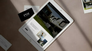
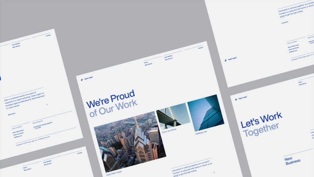
The top web design trend this year is functionality. Businesses are increasingly looking at ways to provide visitors to their website with effective and engaging experiences, and increased functionality is one of the best ways to offer that. Visitors are quick to look past what your website says and focus instead on what it can do. One of the best ways to increase functionality is to incorporate features (or use plugins) that make your website more accessible. For example, you may offer a text-to-speech plugin that automatically converts text on your website to speech in a human voice across a wide number of languages.
User Experience – Design Concept – 00.032
2. Interactivity
The second biggest web design trend this year is interactivity. If you want to breathe new life into your static website, interactive design features and elements are the way to go. From roll-over effects to ripple effects, interactive elements can be both surprising and engaging and are sure to keep visitors on your page longer. If you want to boost engagement, consider using customizable animated graphics and moving elements to attract your visitors’ eyes. If you’re in e-commerce, consider offering a feature that allows users to customers your products in-browser. Showing visitors what you can do – instead of simply telling them – is a web design trend you don’t want to miss.
3. Dark Mode
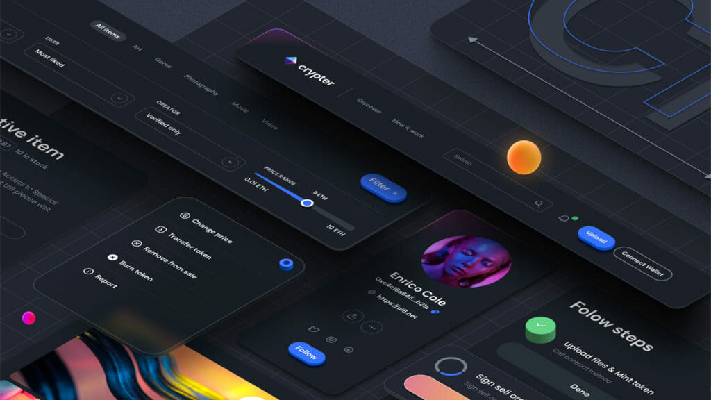
The third biggest web design trend this year is dark mode, a feature that lets users switch the background from light to dark. While white backgrounds have traditionally been used to offer customers good readability, dark mode appeals to users who prefer the higher contrast or who want to use less battery on their mobile device. From a design perspective, dark mode makes neon and pastel colors really pop, but this trend is about more than simply accentuating features on your web pages. Studies have shown that dark mode reduces glare and levels of harmful blue light, which lowers eye strain. So if you want to increase the amount of time that visitors spend on your site, consider adding this option to let visitors toggle between dark and light themes, and they might just stay around longer.

4. Collages
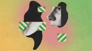
The fourth-biggest web design trend this year is collages. Collages allow you to get your creative message across via a mish-mash of diagrams, photographs, and any other images that your mind can muster. This helps you differentiate your business from others and lets you convey what makes you unique. Collages can be used to create a DIY look and feel, but they can also be used to create a carefully curated portfolio of snapshots.
5. Anti-Design
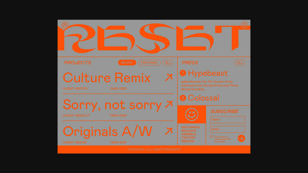
The fifth-biggest web design trend this year is anti-design. There’s no denying that embracing elements like asymmetrical layouts, clashing colors, and mixed fonts may be considered ugly by some. But it is a huge design trend this year and definitely one worth considering. Layered images, harsh shapes, and warped text combined with a user-friendly layout can help you create a subversive look that your visitors will love. Breaking the rules is sure to pique the interest of visitors to your site.

