Why framing matters
In architecture, a good idea does not always do the heavy lifting on its own.
A proposal can be smart, well judged and full of substance, and still fall flat if the bid does not feel right for the people reading it. That is often where visual design quietly does some of its best work. It helps a document feel clear, considered and worth paying attention to before the detail has fully sunk in.
People reviewing bids are not reading them in a vacuum. They are comparing, scanning and making calls quickly. Before they have properly worked through the content, the document is already giving off cues. It tells them whether the thinking feels organised. Whether the team seems in control. Whether the proposal feels resolved or still slightly loose around the edges.
Trust starts before the detail does
That becomes more obvious when the idea itself is unfamiliar.
New materials, unusual positioning or a proposal that sits a little outside expectation can all create hesitation. Not because the idea lacks merit, but because the audience has not yet found their footing with it. A bid has to help them do that. It has to make the work feel legible before it can feel persuasive.
Audience matters here more than people sometimes admit. A design-led audience may warm to originality straight away. Someone coming at it from a commercial angle may need clearer signs of relevance, judgement and fit before they get there. Both reactions make sense. Good bid design understands that and responds to it.
Design is part of the argument
This is why visual design is never just the tidy-up at the end.
It shapes how a proposal is read. It affects what feels important, what feels easy to follow and what stays with the reader. Structure matters. So does pacing. So does restraint. The hierarchy on the page, the use of imagery, the rhythm of the layout, even the amount of space around a key idea, all of it changes the reading experience.
A clear graphic direction also helps pull the wider vision into focus. It suggests that the project has been thought through as a complete proposition, not only architecturally, but in terms of commercial viability, client understanding and audience fit. It shows a level of consideration around who the space is for, how it should be perceived and where it sits within the intended market. That kind of clarity strengthens trust, because it tells the reader the idea has been resolved from more than one angle.
When that is handled well, trust builds almost without fuss. When it is not, even good thinking can start to feel slippery. The information may all be there, but if the document feels crowded, vague or visually unsure of itself, the reader starts to hesitate. Once that doubt creeps in, the bid has more work to do.
When the idea sits outside expectation
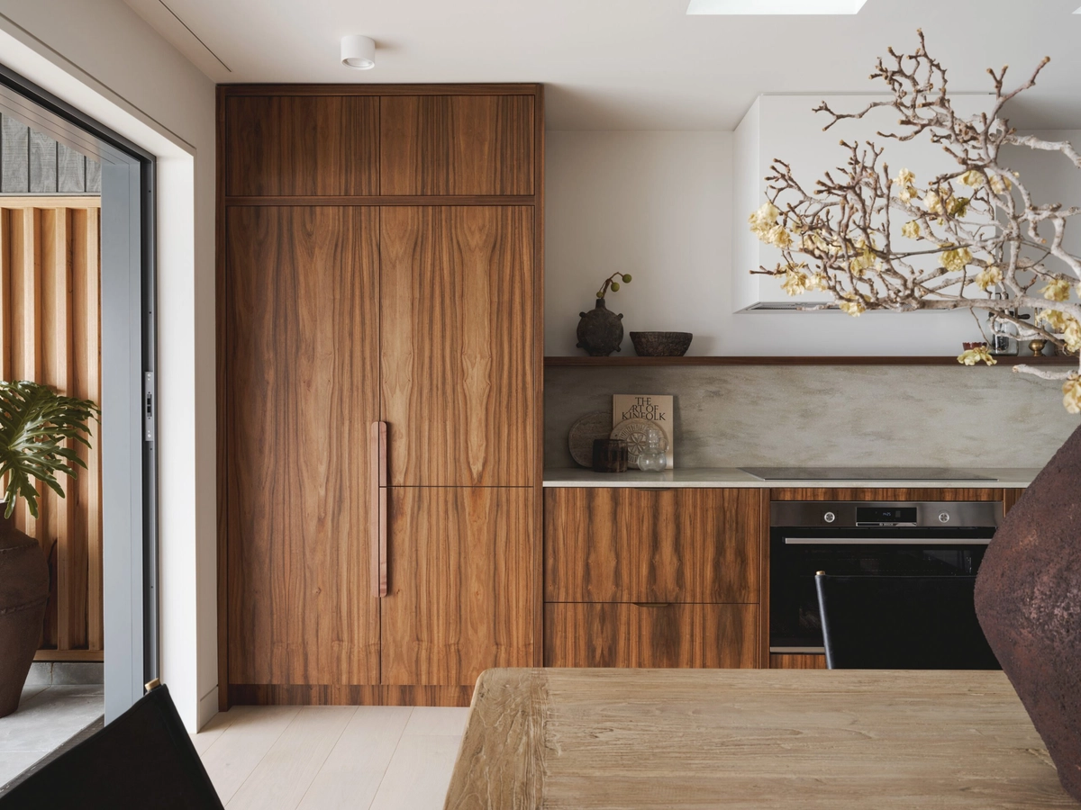
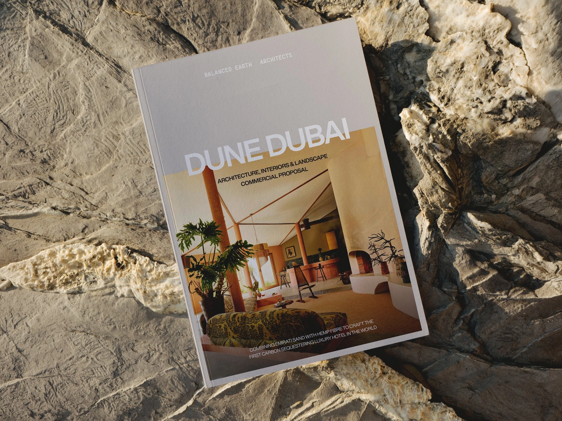
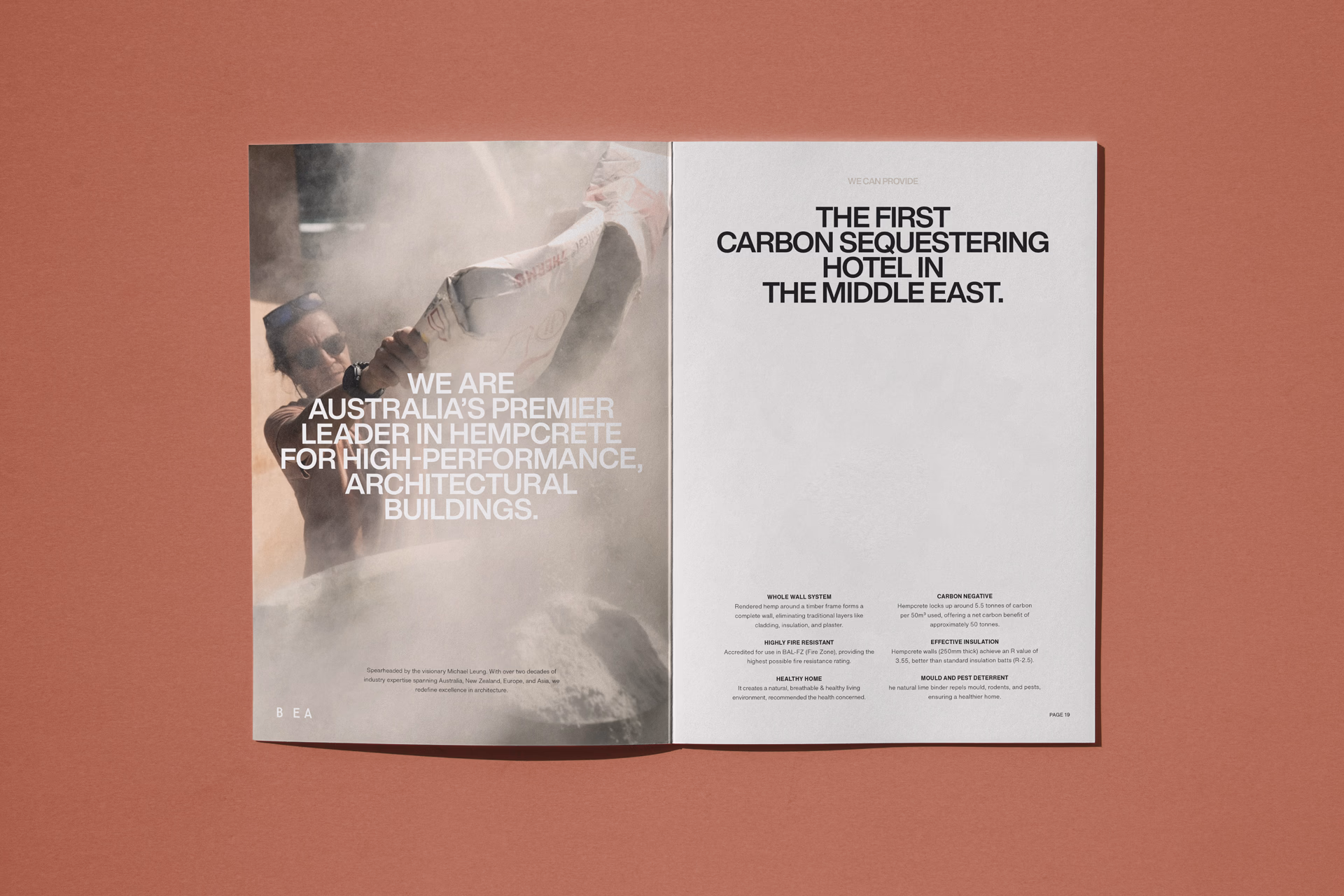
This is where Dune Dubai comes in as a useful example.
It was an architectural bid for a first-of-its-kind eco-resort in Dubai built using hempcrete. The concept did not need saving. It was already strong. The challenge was how to present it so the audience could properly see its quality, its relevance and its place within a premium context.
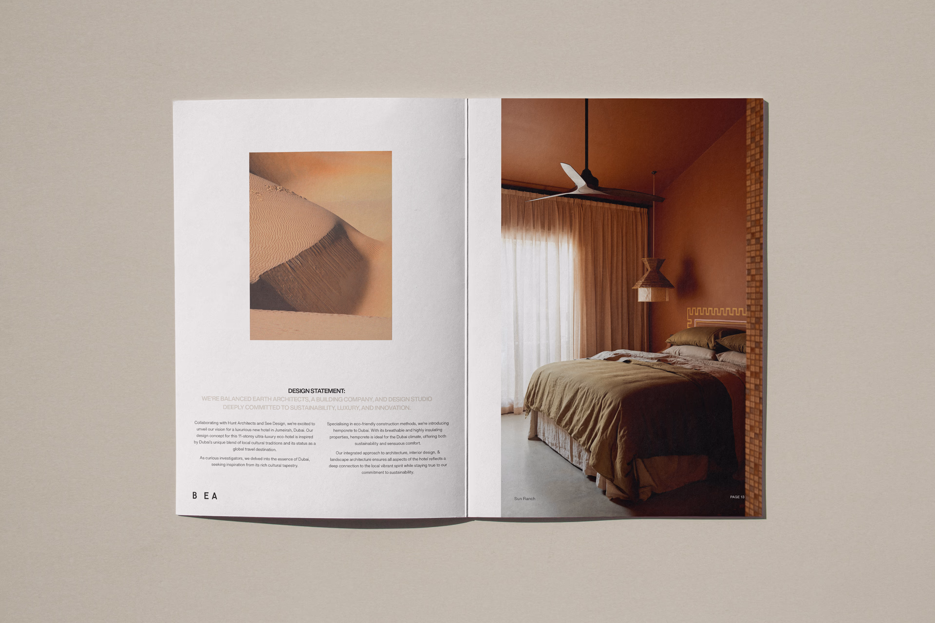
That meant getting the tone right. The presentation had to feel elevated without drifting into abstraction. It had to carry the sustainability story without becoming overly worthy or technical. It had to create a sense of aspiration while still feeling grounded. Put simply, the design had to help the audience meet the idea on familiar ground.
In that sense, the work was less about making the proposal look impressive and more about giving it the right presence. The visual direction had to support a fuller story: that the idea had been considered carefully, that it understood the client, that it understood the end user, and that it had a believable place in the market it was speaking to. Once that is communicated clearly, a bid starts to feel less like a set of claims and more like a coherent proposition.
Tailoring is not compromise
This is the point that tends to get misunderstood.
There is sometimes an assumption that tailoring a bid for a particular audience means softening the idea or dressing it up for approval. I do not see it that way. Tailoring is a form of judgement. It is knowing what needs emphasis, what needs more clarity and what kind of visual language will help the work come through properly.
A good bid does not dilute the idea. It gives it the right setting.
That is why visual design matters so much in this kind of work. It is not there to flatter the proposal. It is there to help people trust what they are looking at.
The broader lesson
This goes beyond one project.
For architecture studios, it shapes how a practice is perceived across bids, submissions and presentations over time. The same piece of thinking can feel sharp or uncertain depending on how it is framed. For business owners more broadly, the principle holds. If you are presenting something complex, high value or not immediately familiar, people are not judging the offer on content alone. They are also responding to how confidently and clearly it has been put in front of them.
That is where presentation starts to carry real weight. It affects whether an audience leans in or keeps their distance.
Creating belief
The strongest bids do more than explain a proposal. They give it enough clarity and presence for people to believe in it.
That usually comes down to judgement rather than drama. Knowing what to bring forward. Knowing what to leave quiet. Knowing how to shape the whole thing so the audience can see the value of the idea without being pushed towards it.
When that happens, visual design is doing far more than making a document look polished. It is helping the work be understood on the terms it deserves.